More Branding + Lettering
THE INDIES
The Indies: Hand drawn lettering
CAMEROON HEALTH & EDUCATION FUND
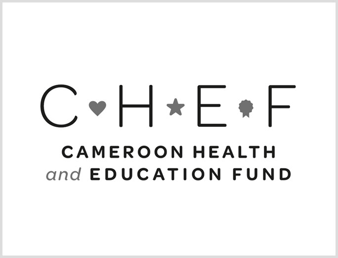
The logo for this nonprofit is loosely based on the Cameroon flag, which is divided into three vertical sections with a star in the center. The icons to the left and right represent health and education, which the organization is working to improve throughout the country.
ERIC GERARDI
Eric Gerardi, a Chicago native and personal trainer, was looking for a dynamic logo and business card that represent strength, growth and movement.
However, it was important that the look not be overly masculine or intimidating, as his client base includes both sexes, some of whom are recovering from injuries, so it was important to convey the supportive aspect of his work as well.
MISTER PERFECT
This up and coming house music producer/DJ needed a mark that represents the two sides of his persona. On the surface, he's classy and clean-cut, but his music has a gritty edge, which he wanted to come through in the logo.
THE LIVING LIFE
The Living Life revolves around raw food, which is all about nourishing our bodies in the purest way possible—forming a deep connection with the source of our food. The source of any plant is a seed, and the source of a seed is the sun, and the image of a sunflower is a clear representation of both the seed and the sun.
You can see more details on the branding process for this one over here!
